National FFA Organization
Founded in 1928, FFA used to be known as Future Farmers of America. The organization eventually shortened its name to FFA because there are now so many ag careers that go beyond production farming. We were called in to help define (and deliver) a clear and consistent brand message.
PROJECT OVERVIEW
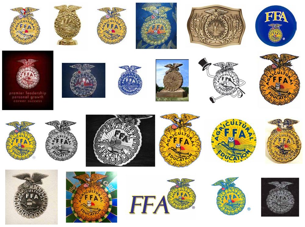
Before we even got started, the client told us the logo and blue corduroy jacket were off-limits. So, naturally, we started by taking a closer look at the logo. While the mark had a strong heritage and powerful symbolism, the artwork was literally a scan of a fax and had degraded to a point where there was very little detail and wasn’t easily scalable.

OUR SOLUTION
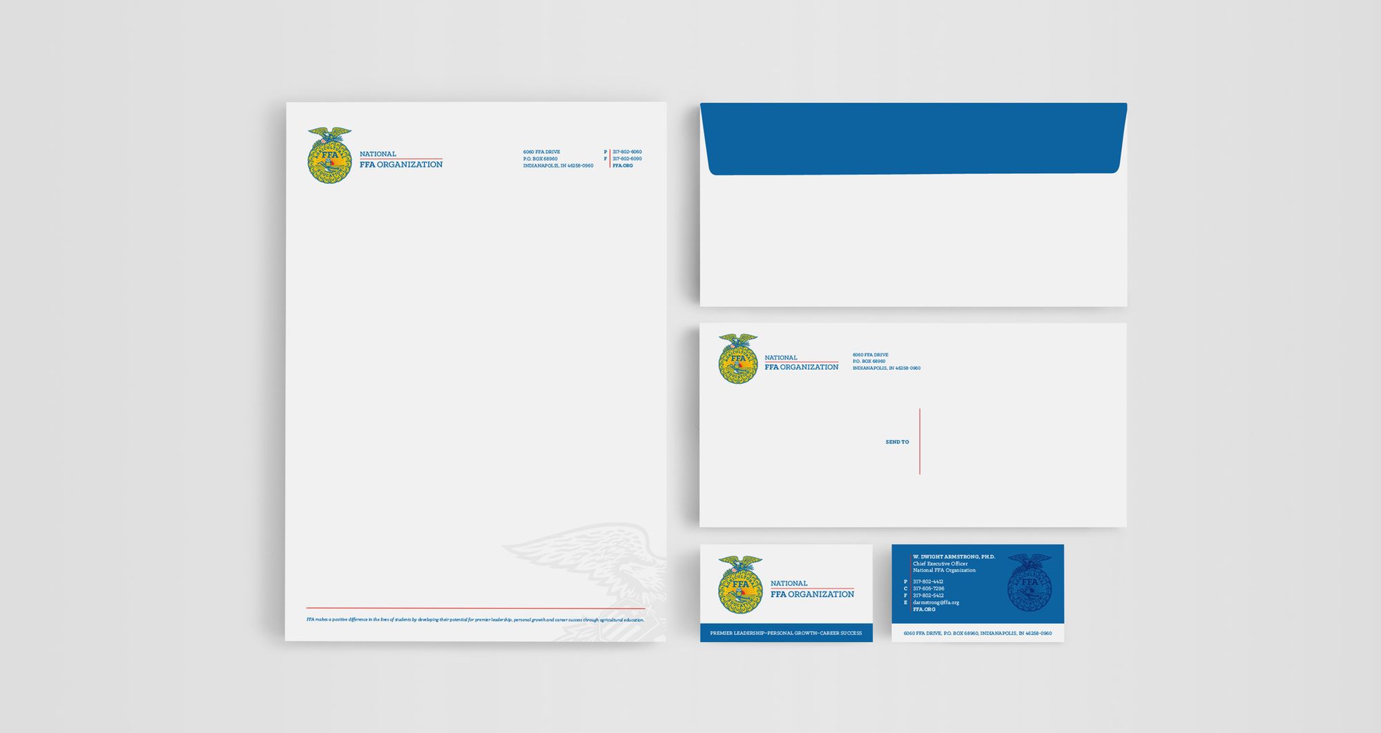
In addition to freshening up the logo, we crafted a brand positioning representing FFA’s past, present, and future. It allowed us to honor the brand's legacy while building a story around how ag has evolved. We also created a comprehensive brand standards manual, including stationery, website templates, and more. The result? A more consistent, effective brand for FFA chapters all across the country.
THE LANDSCAPE
Over the years, FFA’s brand consistency and logo usage have gotten a little out of control. But that’s to be expected since no standards were established to guide and direct the efforts of each individual chapter.

LOGO REFINEMENT
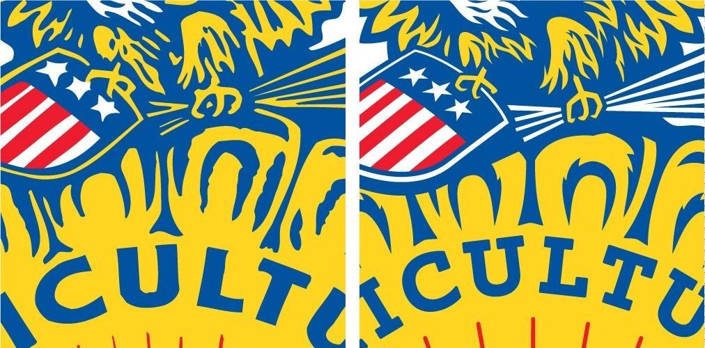
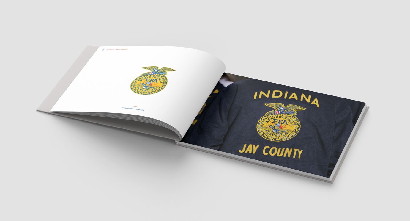
We didn’t redesign the FFA logo; we gave it a makeover. The previous logo was out of balance, the angles of the corn kernels and rays of the sun weren’t consistent, and most of the elements (such as the stars and arrows) weren’t crisp, especially at a smaller scale. We redrew the entire mark, introduced a bold slab serif typeface, and created a much better version of the original, well-established concept.

BRAND POSITIONING
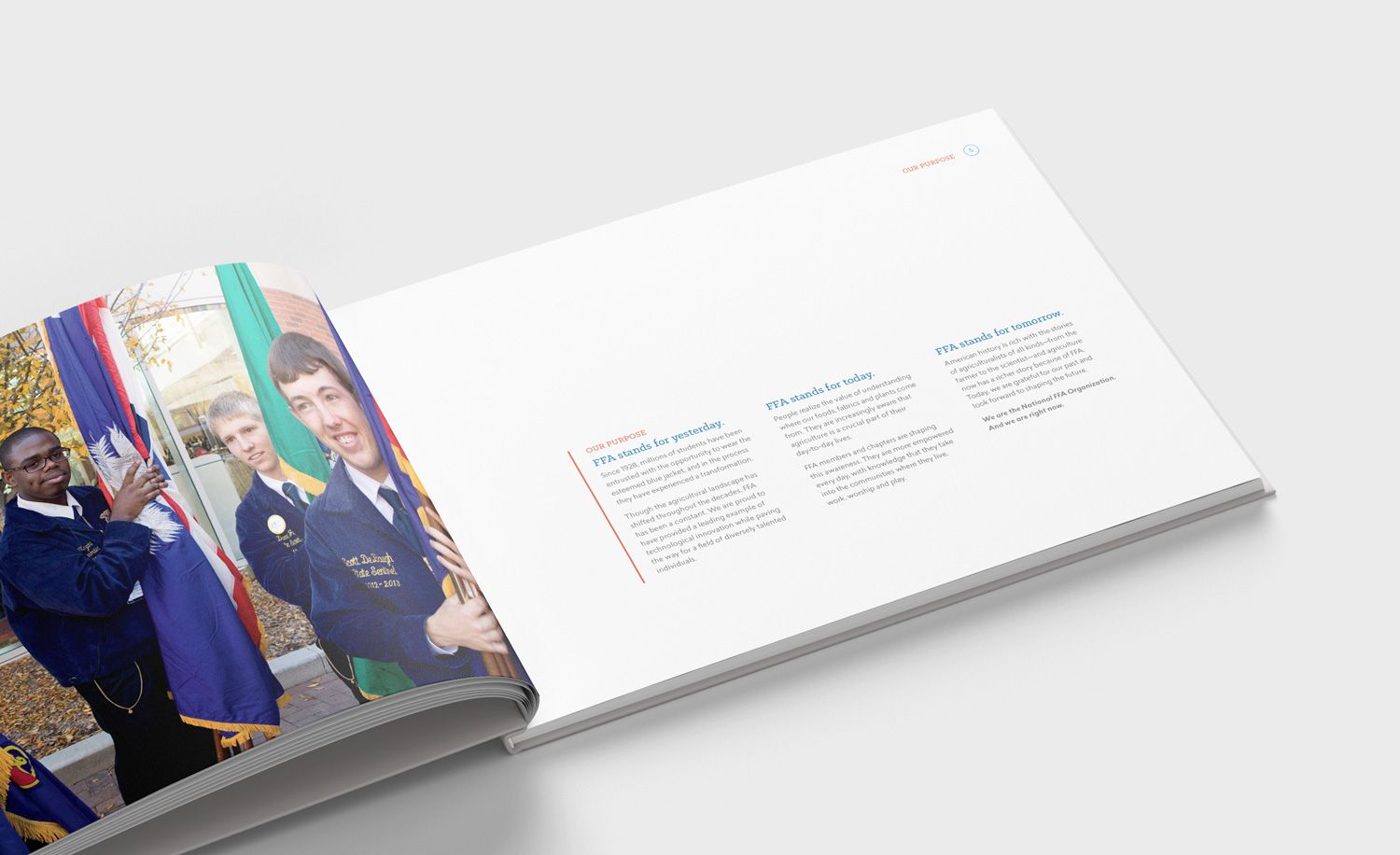
How do you define the voice of a nearly one-century-old brand so that it appeals to a youthful audience? We built our story around the heritage and legacy of FFA while focusing on how ag education will give you the skills you need to succeed in the future. At the same time, we clearly communicated what students can do today to get involved and make an impact.
PHOTOGRAPHY
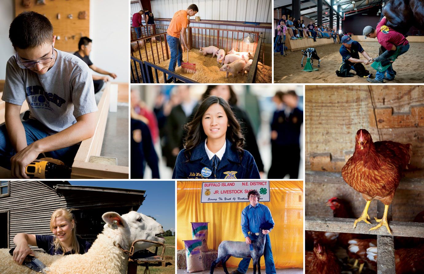
To help create brand unity from Peoria to Puerto Rico, we also developed photography guidelines that provided guidance to individual chapters (whether they were using original photography or stock images). As part of the storytelling process, we organized photography into four main areas of focus: farming, technology/education, food science, and community/leadership.
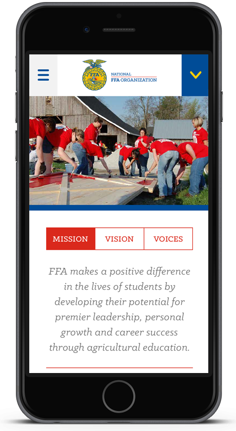
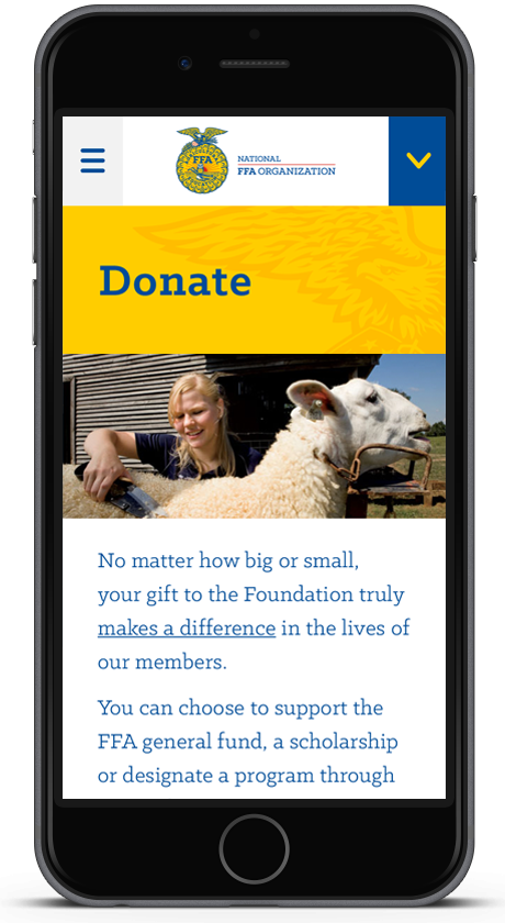
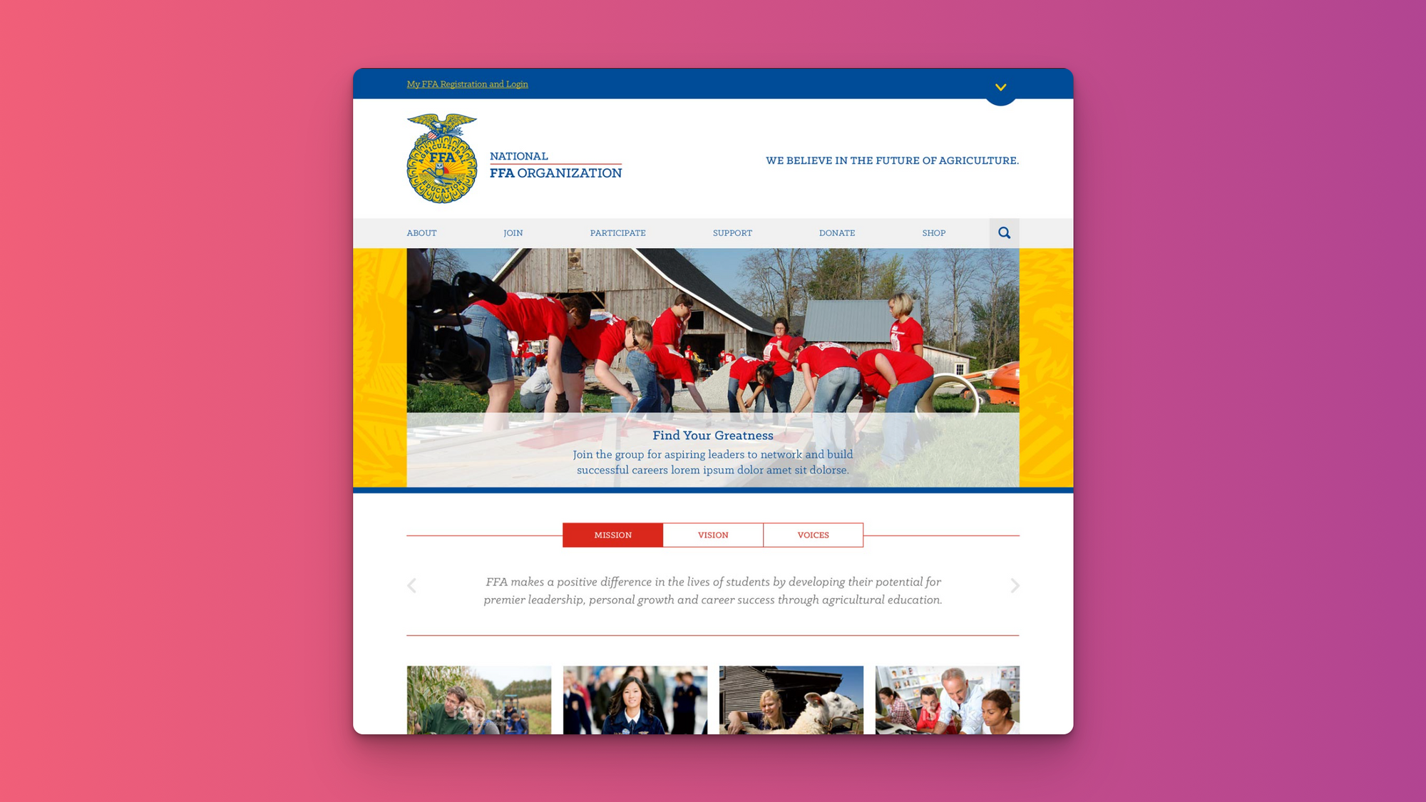
FFA WEBSITE
Once we established the brand voice and identity, we designed a bold, user-friendly website. Working in tandem with FFA’s internal development team, the new design allows for a wide variety of information while focusing on organizational values and FFA’s numerous social channels.
MOBILE